
A nation-wide leader in delivering quality banners and advertising materials was experiencing stagnant conversion rates on their homepage—a page that had previously been the most valuable landing page.
Performance started to flatline across all channels, and it was clear that what had been working in the past wasn’t getting the job done anymore.
We set out to determine the root of the issue and test the homepage with an updated layout that would drive more conversions.
The Problem
The research done prior to making UX adjustments is the most crucial component of an A/B test. Understanding the user journey informs the decision making process and allows us to deliver the experience users want, rather than the experience we think users want.
To help us determine why users weren’t converting, we installed a heatmapping and scroll depth tracking tool that provided a visual snapshot of the user journey. We analyzed over 1,000 unique sessions looking for any common trends that explained declining conversion rates.
We found two patterns that confirmed our suspicions:
- Those who landed on the homepage were looking for a clear next step in their journey, but the page didn’t feature a notable call to action.
- The on-page element that led to the most valuable sessions (i.e., highest conversion rate) was buried below the fold. In fact, it was at the very bottom of the page.
The Solution
Once we had uncovered the source of the stagnant conversion rates, we put our findings into action with a solution that fit two important criteria:
- Had a powerful call to action above the fold.
- Had an intuitive element that directed users to their desired next step with as few clicks as possible.
Fortunately, the high-value on-page element that had been receiving little attention during our heatmap tracking research fit this criteria. Rather than reinventing the wheel, we repurposed this call to action by making minor user interface enhancements that improved usability
Once we felt the call to action met our usability standards, we changed its on-page location to a more prominent position—somewhere that users would not be able to miss.
The Results
In only four short weeks, it was clear that a strong call to action in a prominent location had vastly improved the user experience.
During the 50-50 split test, engagement to this newly featured element skyrocketed, as clicks had increased by more than 900% and transactions saw a healthy 11.2% increase.
Once we had realized the full potential of the improved homepage, we permanently added the above-the-fold call to action. Since then we’ve continued to see significant results.
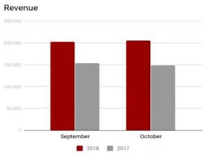
When comparing year-over-year numbers, the conversion rate increased by 75.2% (6.45% vs. 3.68%), bounce rate decreased by 20.9% (43.1% vs. 54.5%), and revenue saw a 35% increase – a total of more than $100,000 in only 60 days.
Users are now finding themselves with a clear path to convert and the homepage is performing at an optimal level.
Takeaway
Don’t underestimate the power of research and careful planning.
The time spent reviewing users sessions on the site had a dramatic impact on our ability to give site visitors exactly what they wanted.